Identity Unveiled
And finally, my company has a new logo.
Rationale:
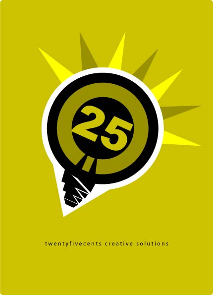
The logo resembles a light bulb, connoting creativity.
Twentyfive represents the nucleus of this idea bulb.
The white background frames the bulb,
making it stand out in any coloured background.
The sharp rays emitted by the bulb, point upwards and outwards,
depicting the companies ambition to offer creative solutions from all angles.
The colours reflect nature, a core call to to conduct business in a way that does not abuse natural resources.
A spiritual aside:
The logo resembles a light bulb, shining the crown of thorns.
My call to be a light to the world, and carry my cross daily.
Comments
kev
kev